Here's a secret: the new Leicester Tigers home kit is out tomorrow.
New kit day is always one to mark in the calendar and the Tigers family have been treated to some iconic strips over the last half-century.
Whether it's the classic green, red and white in retro pea green or modern dark green, whatever combination of funky, striped variants from years gone by, narrowing down a single leading design would be nigh-on impossible.
So, here's ten. Enjoy a walk down Tigers way!
The Vintage
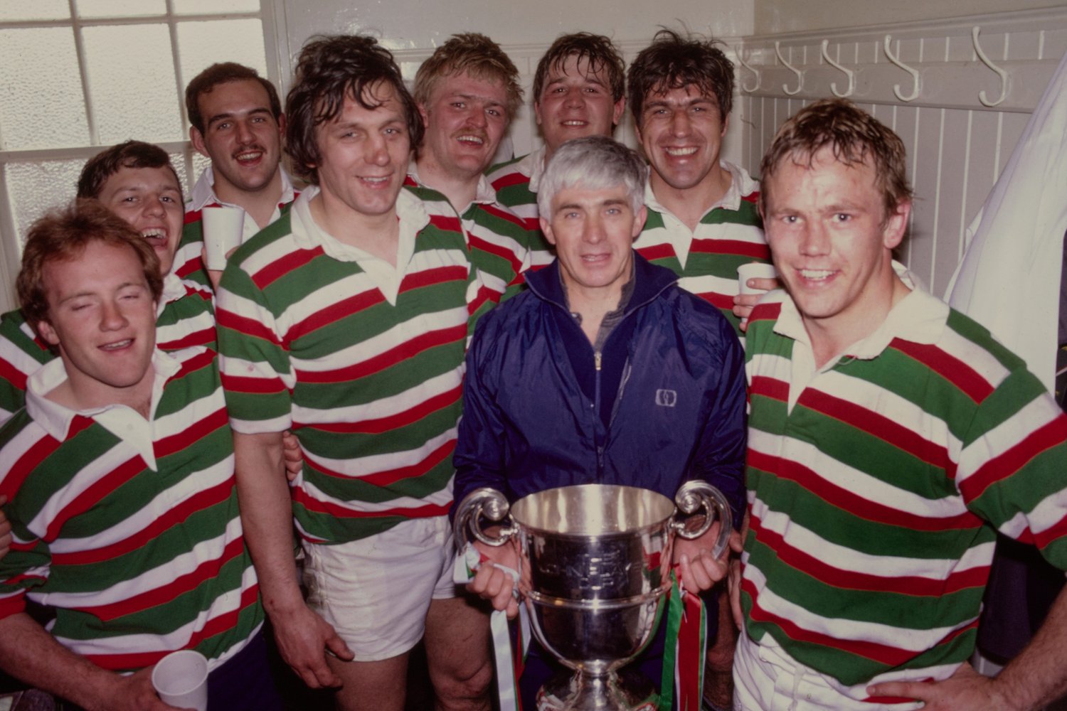
If I were to say 'proper kit' this is surely one of the first to come to mind.
Nothing flashy, no accoutrements, not even a badge. Doesn't matter.
It's green, red and white and this picture does include the most distinct accessory associated with the kit: the John Player Cup.
A beauty.
The 2022 Title | 2021 - 2022

The quintessential juxtaposition to the vintage design shown above, the design from the title-triumph of 21/22 has considerably more going on.
A badge, of course, but also two sets of colours; the classic green, red and white can be found encompassing the torso, sleeves and cuffs respectively but then that's added to with several sets of stripes across the chest (some of which reach all the way across, others only make it to halfway).
Beneath all of that, the piece is then complete with an incredibly complex Mandala Tiger design in the background of the shirt. A far cry from block sets of stripes.
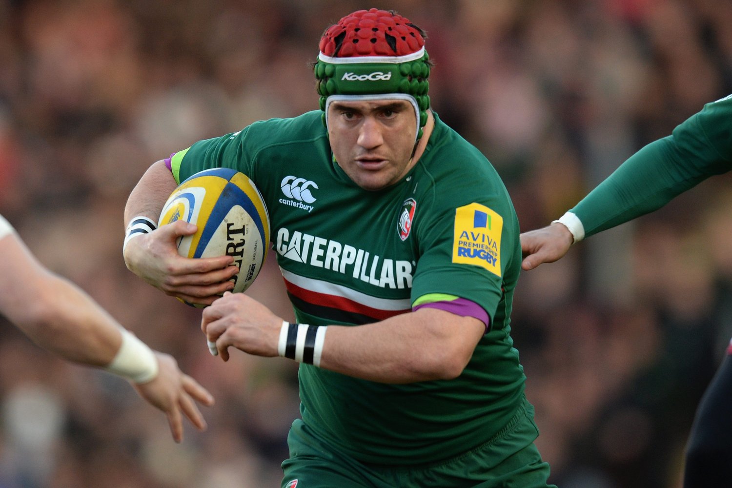
The Stripes | 2012 - 2013
A similarly visually arresting piece, this shirt did not suffer from stripes not quite making it all the way; this shirt is all stripes, all over.
Bar the central chest area, this shirt departs from the classical straight horizontal stripes to fully embrace the Tigers theme, uneven, wiggling stripes stretching across the arms, back and torso.
Almost a camo pattern emerges here, which may in theory work well for evasive wingers but the truth is that there is simply no missing anyone in this design.
The No Nonsense | 2013 - 2014
From many stripes, to very few.
This is as streamlined as a kit can get, not that that is a bad thing. This kit does the job nicely: a red stripe, a white stripe and a lot of green.
That's your lot.
The BIG Stripes

Now we're talking, the stripes are back in a BIG way!
No messing around with this thin stripe madness, here's your stripes, dominating the kit.
Here we also see the dramatic dive into diagonal, jazzing up a simple formula in stylish, slanted ways. It's a few degrees on the protractor from the vertical stripes of the 1890s but is the closest the club has come in the preceding years.
The Side-Stripes | 2002 - 2003

This is a classic design. The block colours of central green and red sleeves with the white collar and sides work very stylishly and the minimalist Tigers badge also contributes to a design more Paris-runway than Mattioli Woods Welford Road.
Additionally, they go for vertical stripes on the shoulder and arm which are quite unique amongst a Tigers kit.
Overall, a sleek design that incorporates elements of the classic kits in interesting ways. It's also a part of the Captain's Collection so this nifty number can be yours even if you weren't shouting from the stands in 2003.
The Classic | 1999 - 2000
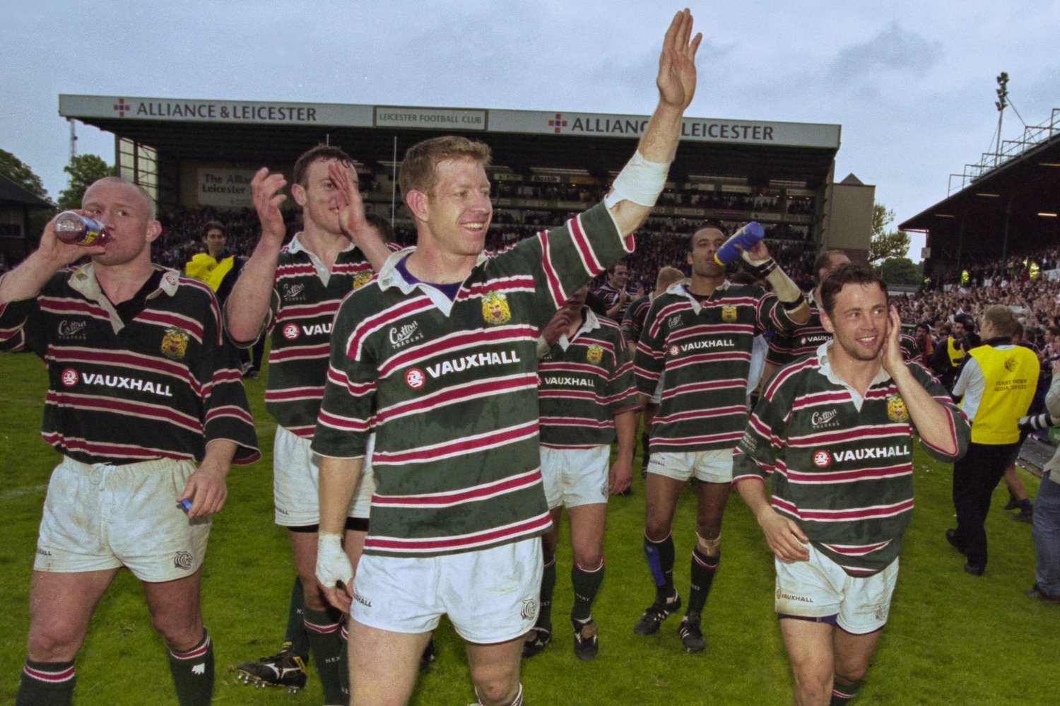
One of the most iconic kits in the club's history, one associated with so much success.